


Learnark is an online learning platform that helps individuals transition into tech careers. The existing website had usability, performance, and SEO challenges, leading to the need for a revamped version—Learnark 2.0.
Challenges with the Current Website

-
Usability Issues
-
Navigation is not intuitive, leading to a drop in engagement.
-
Some CTA buttons are not clear, reducing conversions.
-
The learning dashboard lacks personalization, making it harder for users to track progress.
-
-
Accessibility Issues
-
The contrast between text and background needs improvement for better readability.
-
Lack of proper alt text for images affects visually impaired users.
-
Keyboard navigation is limited, making it difficult for users relying on assistive technologies.
-
-
Performance & Load Time Optimization
-
The landing page is slow due to large video files and heavy design elements.
-
Poor load time negatively impacts SEO, reducing organic traffic.
-
Mobile responsiveness needs improvement to ensure better user experience across devices.
-
-
SEO and Search Visibility
-
Slow page speed leads to lower rankings on search engines.
-
Lack of structured data affects how courses appear in search results.
-
Missing metadata and poorly optimized images hurt content discoverability.
-
The Process
1
Competitor Analysis
Research
Identifying Problems
Competitor Analysis
SEO Audit
User Surveys
Ideation & Strategy
Defining Key Improvements
User Journey
Creating the SEO & Content Strategy
2
3
Design ( Figma)
UI/UX Redesign (New Visual Language & Layout)
Mobile-First & Responsive Design Optimization
Design System & Style Guide Creation
4
Implementation ( Wix Studio)
Translating Figma Designs into Wix Studio
Performance Optimization (Lazy Loading)
SEO Implementation (Metadata, Structured Data, Image Optimization)
5
Testing, Launch & Iteration
Testing on Multiple Devices & Browsers
SEO & Speed Performance Re-evaluation
Continuous Improvements Based on User Feedback
_edited.png)
.png)
.png)
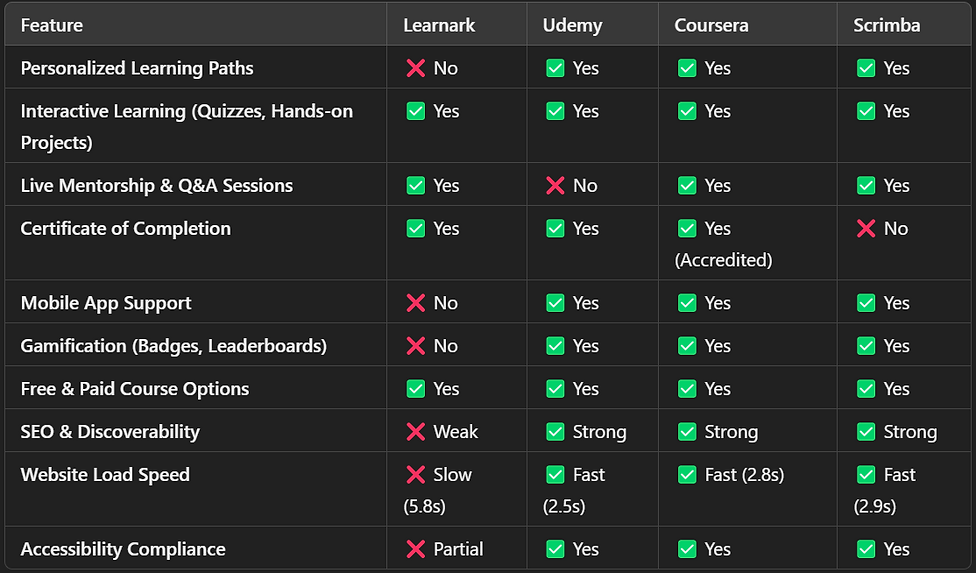
Competitive Analysis Objective:
Objective:
Identify industry best practices and gaps in Learnark’s user experience.
Competitors Analyzed:


Research & Analysis
To ensure a data-driven redesign, we conducted research focusing on user behavior, competitive analysis, and technical performance audits.
Methodology:
-
User Surveys: Sent to existing learners (response rate: 127 out of 400 users).
-
Usability Testing: 5 users completed key tasks like signing up, browsing courses, and making payments.
Findings:
-
75% of users found the landing page cluttered.
-
60% abandoned the course enrollment form due to unclear instructions.
-
50% had difficulty navigating between courses and dashboards.
Key Insights:
🚨 Critical Issues (Must Fix ASAP)
-
Slow Website Speed (5.8s Load Time) → Optimize images, enable lazy loading, minify scripts.
-
Weak SEO (Low Discoverability) → Improve structured data, metadata, and page speed.
⚠️ High-Priority Areas
-
No Personalized Learning Paths → Implement AI-driven course recommendations.
-
No Mobile App Support → Develop a mobile-first experience for better engagement.
🟡 Moderate Concerns
-
Lack of Gamification → Add badges, leaderboards, and learning streaks.
-
Accessibility Gaps → Fix contrast issues, improve keyboard navigation, and add alt text.
🚀 Next Steps:
-
Fix website speed & SEO.
-
Improve accessibility & mobile usability.
-
Introduce gamification & personalized learning.
Overview of SEO & Performance Issues
📌 Objective: Identify weaknesses affecting search rankings, user engagement, and site speed.
📌 Key Problems Identified:
-
Slow page speed (5.8s load time) → Causing high bounce rates.
-
Missing SEO metadata & structured data → Low Google discoverability.
-
Unoptimized images & heavy elements → Affecting performance.
📌 On-Page SEO Issues

Action Plan & Expected Improvements
📌 SEO Fixes:
✅ Add structured data & meta descriptions.
✅ Optimize headings & internal linking.
✅ Improve keyword targeting & content strategy.
📌 Performance Fixes:
✅ Reduce video size & use lazy loading.
✅ Compress images & enable caching.
✅ Optimize server response & scripts.
Sitemap Of The Template
A UI sitemap, or user experience (UX) sitemap, is a diagram that shows how the pages on a website are related to each other. It's also known as an information architecture (IA) diagram or content outline.
🎨 Color Styles
These are the colors that shaped this template's design, selected with care and intention. Feel free to adjust them to give your design a fresh and harmonious update.
Absolute Colors
This is a absolute white and black.
White
#FFF
Black
#000
Yellow shades
Primary Colors - The foundational color representing brand identity in this template
50
#FFBF23
70
#FFBC00
75
#FEC801
80
FCCC44
90
#FFEACC
95
#FFF4E5
97
#FFF9F0
99
#FFFDFA
White Shades
Light Colors - Setting the thematic tone and serving as the predominant background hues in this template
90
#E4E4E7
95
#F1F1F3
97
#F7F7F8
99
#FCFCFD
Grey Shades
Dark Colors - Employed for creating inviting and readable text elements throughout the template
10
#191919
15
#262626
20
#333333
30
#4C4C4D
35
#59595A
40
#656567
60
#7a7474
70
#908b8b
🪄 Assets
Below, you'll find a list of the assets utilized in this template.
Logo
For Desktop
For Laptop
For Mobile
Abstract Design
.png)


Home Page
_edited.jpg)
Courses Page


